January seemed to go on for an extremely long time. However, we're finally at the end of the month which means it's time to celebrate the 30 new school and trust website launches we've had so far this year.
Take a look below at a selection of our recent Latest Lives and if you're inspired to start a new school website project, why not book a free consultation with our team? We'd love to hear from you.
Xavier Catholic Education Trust
Strong brand continuity and a bold colour palette help to give a powerful first impression for this 15 school multi-academy trust. News is pulled in from across the schools to keep the homepage content fresh and a colour-coded multi-pin map is an ideal way to showcase the breadth of schools within the MAT.
Braidwood Trust School for The Deaf
This exciting SEN website project features a cog-themed design based around their logo as well as video content and a bespoke curriculum area which comes complete with a signed version to aid accessibility to their stakeholders. Key pages are signposted at the top of the website through icon-led quick links.
South View Primary School
This bespoke primary school design is fresh and contemporary creating a soft corporate style. We love the superhero style values section, large outlined numbers on the events feed and key call to action sections on the homepage. A burger menu keeps the content neat and tidy whilst adding to the impact of the full-width slideshow.
Altrincham Grammar School for Boys
A fantastic example of a secondary school website design, AGSB's design features a split menu with a centralised logo, professional photography, a mixed news feed and house points as well as a bespoke testimonials' area highlighted in eye-catching yellow. Step further into the website to find a bespoke story wall and pop-out welcome messages from the prefects.
Evolution Academy Trust
Every trust website design is unique, offering MATs a chance to really make their mark on the sector. For Evolution Academy Trust we created a professional, clean design with lines that follow the user down the page, a dedicated clear school profiles section and tiled top level landing pages. The original logo was redrawn to be crisp and scalable across a wide range of devices.
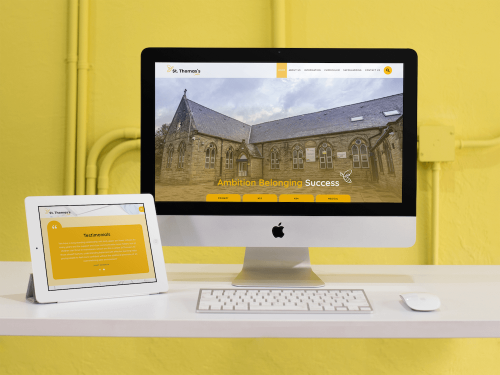
St Thomas's Centre
This all-through pupil referral centre website is bright and vibrant to reflect their values statement of 'Ambition Belonging Success'. Key areas of the website are accessed through homepage tabs and the bee motif is watermarked around the website to add additional style and character. The homepage testimonials tab is a brilliant way to give social proof from parents and is a stand-out feature of this design.
Some useful free resources for you and your school or trust
- Websites
- Latest Live
You might also like...
New year, new start
A new year (calendar or academic) is the chance for a fresh start. Goals are set, mistakes are relegated to the past and there’s generally a feeling of ‘newness’ in the air. Whether you’re looking for a new school website design, wanting to improve your school newsletter f...
DfE Compliance: Displaying your curriculum on your school website
Your school website is key source of information for parents, students, staff and the community, but there is certain content that you must always have visible on your website, and which will be checked by Ofsted inspectors prior to a visit. We have a full guide to all of these requirements which...


